> ## Documentation Index
> Fetch the complete documentation index at: https://cometchat-22654f5b-docs-llms-scoped-indexes.mintlify.site/llms.txt
> Use this file to discover all available pages before exploring further.
# Card Bubble
> Card Bubble — CometChat documentation.
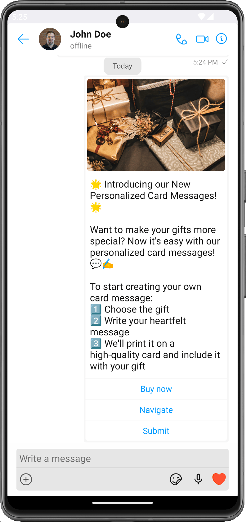
The `CometChatCardBubble` component is used to display a card within a chat bubble. The card includes an image, text, and action buttons. It helps to offer action-oriented chat experiences, like booking a flight, ordering food, scheduling a meeting, etc., directly in the chat.
 ## Methods
| Methods | Parameters | Description |
| - | - | - |
| setCardMessage | CardMessage | An instance of the `CardMessage` class which holds information about the card such as image URL, text, and action buttons. |
| setStyle | CardBubbleStyle | An instance of the `CardBubbleStyle` class for customizing the appearance of the card bubble. |
## CardBubbleStyle
`CardBubbleStyle` is a class containing attributes to customize the appearance of the card in the `CometChatCardBubble` component.
| Methods | Type | Description |
| - | - | - |
| setBackground | @ColorInt int | Used to set the background color of the card bubble. |
| setCornerRadius | flot | Used to set the corner radius of the card bubble. |
| setBorderWidth | int | Used to set the Border width |
| setBorderColor | @ColorInt int | Used to set the Border color |
| setTextAppearance | @StyleRes int | Used to set the font style of the title. The object should include `fontFamily`, `fontSize`, and `fontWeight`. |
| setTextColor | @ColorInt int | Used to set the color of the title. |
| setButtonBackgroundColor | ButtonStyleInterface | Used to customize the style of buttons. |
| setButtonTextColor | @ColorInt int | Used to set Button text color. |
| setButtonTextAppearance | @StyleRes int | Used to set Button text appearance |
| setContentBackgroundColor | @ColorInt int | Used to set Content background color |
| setButtonSeparatorColor | @ColorInt int | Used to set Button separator color |
| setProgressBarTintColor | @ColorInt int | Used to set the color of the image in the card. |
| setQuickViewStyle | QuickViewStyle | Used to set the QuickView style |
| setImageBubbleStyle | ImageBubbleStyle | Used to set how to resize the image in the card. |
## Usage
```xml theme={null}
```
This documentation is built and hosted on [Mintlify](https://mintlify.com), a developer documentation platform.
## Methods
| Methods | Parameters | Description |
| - | - | - |
| setCardMessage | CardMessage | An instance of the `CardMessage` class which holds information about the card such as image URL, text, and action buttons. |
| setStyle | CardBubbleStyle | An instance of the `CardBubbleStyle` class for customizing the appearance of the card bubble. |
## CardBubbleStyle
`CardBubbleStyle` is a class containing attributes to customize the appearance of the card in the `CometChatCardBubble` component.
| Methods | Type | Description |
| - | - | - |
| setBackground | @ColorInt int | Used to set the background color of the card bubble. |
| setCornerRadius | flot | Used to set the corner radius of the card bubble. |
| setBorderWidth | int | Used to set the Border width |
| setBorderColor | @ColorInt int | Used to set the Border color |
| setTextAppearance | @StyleRes int | Used to set the font style of the title. The object should include `fontFamily`, `fontSize`, and `fontWeight`. |
| setTextColor | @ColorInt int | Used to set the color of the title. |
| setButtonBackgroundColor | ButtonStyleInterface | Used to customize the style of buttons. |
| setButtonTextColor | @ColorInt int | Used to set Button text color. |
| setButtonTextAppearance | @StyleRes int | Used to set Button text appearance |
| setContentBackgroundColor | @ColorInt int | Used to set Content background color |
| setButtonSeparatorColor | @ColorInt int | Used to set Button separator color |
| setProgressBarTintColor | @ColorInt int | Used to set the color of the image in the card. |
| setQuickViewStyle | QuickViewStyle | Used to set the QuickView style |
| setImageBubbleStyle | ImageBubbleStyle | Used to set how to resize the image in the card. |
## Usage
```xml theme={null}
```
This documentation is built and hosted on [Mintlify](https://mintlify.com), a developer documentation platform.