> ## Documentation Index
> Fetch the complete documentation index at: https://cometchat-22654f5b-docs-llms-scoped-indexes.mintlify.site/llms.txt
> Use this file to discover all available pages before exploring further.
# Groups
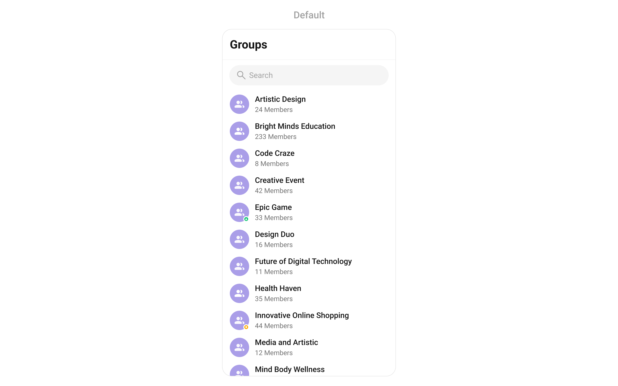
> Scrollable list of all available groups with search, avatars, group type indicators, and member counts.
| Field | Value |
| - | - |
| Component | `CometChatGroups` |
| Package | `cometchat_chat_uikit` |
| Import | `import 'package:cometchat_chat_uikit/cometchat_chat_uikit.dart';` |
| Purpose | Scrollable list of all available groups with search, avatars, group type indicators, and member counts. |
| Data props | `groupsRequestBuilder` · `searchKeyword` |
| Actions | `onSelection` · `onBack` · `onItemTap` · `onItemLongPress` · `onError` · `onLoad` · `onEmpty` — [details](#actions-and-events) |
| View slots | `subtitleView` · `listItemView` · `loadingStateView` · `emptyStateView` · `errorStateView` · `appBarOptions` · `titleView` · `leadingView` · +1 more — [details](#custom-view-slots) |
| Styling | `groupsStyle` — the app `ThemeData` does not reach inside a kit widget, so scope colours here. |
| Layout | Fills its parent — place it in an `Expanded` (or a sized box) inside a `Column`, or layout throws an unbounded-height error at render. |
| Prerequisites | `CometChatUIKit` initialised and a user logged in. |
| Full props | [41 props](#functionality) |
`CometChatGroups` renders a scrollable list of all available groups with real-time updates for group events, search, avatars, group type indicators (public/private/password), and member counts.
 ***
## Where It Fits
`CometChatGroups` is a list component. It renders all available groups and emits the selected `Group` via `onItemTap`. Wire it to `CometChatMessageHeader`, `CometChatMessageList`, and `CometChatMessageComposer` to build a group chat layout.
```dart theme={null}
CometChatGroups(
onItemTap: (context, group) {
// Navigate to group chat
},
)
```
***
## Quick Start
Using Navigator:
```dart theme={null}
Navigator.push(context, MaterialPageRoute(builder: (context) => const CometChatGroups()));
```
Embedding as a widget:
```dart theme={null}
@override
Widget build(BuildContext context) {
return Scaffold(
body: SafeArea(
child: CometChatGroups(),
),
);
}
```
Prerequisites: CometChat SDK initialized with `CometChatUIKit.init()`, a user logged in, and the UI Kit dependency added.
***
## Filtering Groups
Pass a `GroupsRequestBuilder` to control what loads:
```dart theme={null}
CometChatGroups(
groupsRequestBuilder: GroupsRequestBuilder()
..limit = 10
..searchKeyword = "team",
)
```
### Filter Recipes
| Recipe | Builder property |
| - | - |
| Limit per page | `..limit = 10` |
| Search by keyword | `..searchKeyword = "team"` |
| Joined groups only | `..joinedOnly = true` |
| Filter by tags | `..tags = ["project"]` |
| With tags | `..withTags = true` |
***
## Actions and Events
### Callback Methods
#### `onItemTap`
Fires when a group row is tapped. Primary navigation hook.
```dart theme={null}
CometChatGroups(
onItemTap: (context, group) {
// Navigate to group chat screen
},
)
```
#### `onItemLongPress`
Fires when a group row is long-pressed.
```dart theme={null}
CometChatGroups(
onItemLongPress: (context, group) {
// Show context menu
},
)
```
#### `onBack`
Fires when the user presses the back button in the app bar.
```dart theme={null}
CometChatGroups(
onBack: () {
Navigator.pop(context);
},
)
```
#### `onSelection`
Fires when groups are selected/deselected in multi-select mode.
```dart theme={null}
CometChatGroups(
selectionMode: SelectionMode.multiple,
onSelection: (selectedGroups) {
// Handle selected groups
},
)
```
#### `onError`
Fires on internal errors.
```dart theme={null}
CometChatGroups(
onError: (e) {
debugPrint("Error: $e");
},
)
```
#### `onLoad`
Fires when the list is successfully fetched and loaded.
```dart theme={null}
CometChatGroups(
onLoad: (groupList) {
debugPrint("Loaded ${groupList.length} groups");
},
)
```
#### `onEmpty`
Fires when the list is empty after loading.
```dart theme={null}
CometChatGroups(
onEmpty: () {
debugPrint("No groups found");
},
)
```
### SDK Events (Real-Time, Automatic)
The component listens to these SDK events internally. No manual setup needed.
| SDK Listener | Internal behavior |
| - | - |
| `onGroupMemberJoined` | Updates group member count |
| `onGroupMemberLeft` | Updates group member count |
| `onGroupMemberKicked` | Updates group member count, removes group if logged-in user was kicked |
| `onGroupMemberBanned` | Updates group member count, removes group if logged-in user was banned |
| `onMemberAddedToGroup` | Updates group member count |
| `ccGroupCreated` | Adds new group to list |
| `ccGroupDeleted` | Removes group from list |
| Connection reconnected | Triggers silent refresh |
***
## Functionality
| Property | Type | Default | Description |
| - | - | - | - |
| `groupsBloc` | `GroupsBloc?` | `null` | `groupsBloc` Optional external GroupsBloc instance. |
| `groupsProtocol` | `GroupsBuilderProtocol?` | `null` | `groupsProtocol` set custom groups request builder protocol @deprecated Use groupsBloc for custom implementations |
| `subtitleView` | `Widget? Function(BuildContext context, Group group)?` | `null` | `subtitleView` to set subtitle for each group |
| `listItemView` | `Widget Function(Group group)?` | `null` | `listItemView` set custom view for each group |
| `groupsStyle` | `CometChatGroupsStyle?` | `null` | `groupsStyle` sets style |
| `scrollController` | `ScrollController?` | `null` | `scrollController` sets controller for the list |
| `searchPlaceholder` | `String?` | `null` | Search placeholder text |
| `backButton` | `Widget?` | `null` | `backButton` back button |
| `showBackButton` | `bool` | `true` | Toggle back button |
| `searchBoxIcon` | `Widget?` | `null` | `searchBoxIcon` search icon |
| `hideSearch` | `bool` | `false` | Toggle search bar |
| `selectionMode` | `SelectionMode?` | `null` | Enable selection mode (`single` or `multiple`) |
| `onSelection` | `Function(List?)?` | `null` | `onSelection` function will be performed |
| `title` | `String?` | `null` | Custom app bar title |
| `groupsRequestBuilder` | `GroupsRequestBuilder?` | `null` | `groupsRequestBuilder` custom request builder @deprecated Use groupsBloc for custom implementations |
| `hideError` | `bool?` | `null` | `hideError` toggle visibility of error dialog |
| `loadingStateView` | `WidgetBuilder?` | `null` | `loadingStateView` returns view for loading state |
| `emptyStateView` | `WidgetBuilder?` | `null` | `emptyStateView` returns view for empty state |
| `errorStateView` | `WidgetBuilder?` | `null` | `errorStateView` returns view for error state behind the dialog |
| `appBarOptions` | `List Function(BuildContext context)?` | `null` | `appBarOptions` list of options to be visible in app bar |
| `passwordGroupIcon` | `Widget?` | `null` | `passwordGroupIcon` sets icon in status indicator for password group |
| `privateGroupIcon` | `Widget?` | `null` | `privateGroupIcon` sets icon in status indicator for private group |
| `activateSelection` | `ActivateSelection?` | `null` | `activateSelection` lets the widget know if groups are allowed to be selected |
| `onBack` | `VoidCallback?` | `null` | `onBack` callback triggered on closing this screen |
| `onItemTap` | `Function(BuildContext context, Group group)?` | `null` | `onItemTap` callback triggered on tapping a group item |
| `onItemLongPress` | `Function(BuildContext context, Group group)?` | `null` | `onItemLongPress` callback triggered on pressing for long on a group item |
| `onError` | `OnError?` | `null` | `onError` callback triggered on error |
| `submitIcon` | `Widget?` | `null` | `submitIcon` will override the default submit icon |
| `hideAppbar` | `bool?` | `false` | Toggle app bar visibility |
| `controllerTag` | `String?` | `null` | Group tag to create from, if this is passed its parent responsibility to close this @deprecated Use groupsBloc parameter for external bloc injection |
| `height` | `double?` | `null` | `height` provides height to the widget |
| `width` | `double?` | `null` | `width` provides width to the widget |
| `searchKeyword` | `String?` | `null` | `searchKeyword` Used to set searchKeyword to fetch initial list with |
| `onLoad` | `OnLoad?` | `null` | `onLoad` callback triggered when list is fetched and load |
| `onEmpty` | `OnEmpty?` | `null` | `onEmpty` callback triggered when the list is empty |
| `groupTypeVisibility` | `bool?` | `true` | `groupTypeVisibility` Hide the group type icon which is visible on the group icon. |
| `setOptions` | `List? Function( Group group, GroupsBloc bloc, BuildContext context, )?` | `null` | `setOptions` sets List of actions available on the long press of list item |
| `addOptions` | `List? Function( Group group, GroupsBloc bloc, BuildContext context, )?` | `null` | `addOptions` adds into the current List of actions available on the long press of list item |
| `titleView` | `Widget? Function(BuildContext context, Group group)?` | `null` | `titleView` to set title view for each group |
| `leadingView` | `Widget? Function(BuildContext context, Group group)?` | `null` | `leadingView` to set leading view for each group |
| `trailingView` | `Widget? Function(BuildContext context, Group group)?` | `null` | `trailingView` to set tailView for each group |
***
## Custom View Slots
### Leading View
Replace the avatar / left section.
```dart theme={null}
CometChatGroups(
leadingView: (context, group) {
return CircleAvatar(
child: Text(group.name?[0] ?? "G"),
);
},
)
```
### Title View
Replace the group name / title text.
```dart theme={null}
CometChatGroups(
titleView: (context, group) {
return Text(
group.name ?? "",
style: TextStyle(fontWeight: FontWeight.bold),
);
},
)
```
### Subtitle View
Replace the subtitle text below the group name.
```dart theme={null}
CometChatGroups(
subtitleView: (context, group) {
return Text(
"${group.membersCount} members",
style: TextStyle(color: Color(0xFF727272), fontSize: 14),
);
},
)
```
### Trailing View
Replace the right section of each group item.
```dart theme={null}
CometChatGroups(
trailingView: (context, group) {
return Text(group.type ?? "");
},
)
```
### List Item View
Replace the entire list item row.
```dart theme={null}
CometChatGroups(
listItemView: (group) {
return ListTile(
leading: CircleAvatar(child: Text(group.name?[0] ?? "G")),
title: Text(group.name ?? ""),
subtitle: Text("${group.membersCount} members"),
);
},
)
```
### State Views
```dart theme={null}
CometChatGroups(
emptyStateView: (context) => Center(child: Text("No groups found")),
errorStateView: (context) => Center(child: Text("Something went wrong")),
loadingStateView: (context) => Center(child: CircularProgressIndicator()),
)
```
***
## Common Patterns
### Minimal list — hide all chrome
```dart theme={null}
CometChatGroups(
hideAppbar: true,
hideSearch: true,
)
```
### Joined groups only
```dart theme={null}
CometChatGroups(
groupsRequestBuilder: GroupsRequestBuilder()
..joinedOnly = true,
)
```
***
## Advanced
### BLoC Access
Provide a custom `GroupsBloc` to override behavior:
```dart theme={null}
CometChatGroups(
groupsBloc: CustomGroupsBloc(),
)
```
### Extending GroupsBloc
`GroupsBloc` uses the `ListBase` mixin with override hooks:
```dart theme={null}
class CustomGroupsBloc extends GroupsBloc {
@override
void onItemAdded(Group item, List updatedList) {
// Custom sorting logic
super.onItemAdded(item, updatedList);
}
@override
void onListReplaced(List previousList, List newList) {
// Filter out specific groups
final filtered = newList.where((g) => g.membersCount > 0).toList();
super.onListReplaced(previousList, filtered);
}
}
```
For `ListBase` override hooks (`onItemAdded`, `onItemRemoved`, `onItemUpdated`, `onListCleared`, `onListReplaced`), see [BLoC & Data — ListBase Hooks](/ui-kit/flutter/customization-bloc-data#listbase-hooks).
### Public BLoC Events
| Event | Description |
| - | - |
| `LoadGroups({searchKeyword, silent})` | Load initial groups. `silent: true` keeps existing list visible. |
| `LoadMoreGroups()` | Load next page (pagination) |
| `RefreshGroups()` | Refresh the list |
| `SearchGroups(keyword)` | Search groups with debouncing |
***
## Style
```dart theme={null}
CometChatGroups(
groupsStyle: CometChatGroupsStyle(
avatarStyle: CometChatAvatarStyle(
borderRadius: BorderRadius.circular(8),
backgroundColor: Color(0xFFFBAA75),
),
statusIndicatorStyle: CometChatStatusIndicatorStyle(),
),
)
```
***
## Where It Fits
`CometChatGroups` is a list component. It renders all available groups and emits the selected `Group` via `onItemTap`. Wire it to `CometChatMessageHeader`, `CometChatMessageList`, and `CometChatMessageComposer` to build a group chat layout.
```dart theme={null}
CometChatGroups(
onItemTap: (context, group) {
// Navigate to group chat
},
)
```
***
## Quick Start
Using Navigator:
```dart theme={null}
Navigator.push(context, MaterialPageRoute(builder: (context) => const CometChatGroups()));
```
Embedding as a widget:
```dart theme={null}
@override
Widget build(BuildContext context) {
return Scaffold(
body: SafeArea(
child: CometChatGroups(),
),
);
}
```
Prerequisites: CometChat SDK initialized with `CometChatUIKit.init()`, a user logged in, and the UI Kit dependency added.
***
## Filtering Groups
Pass a `GroupsRequestBuilder` to control what loads:
```dart theme={null}
CometChatGroups(
groupsRequestBuilder: GroupsRequestBuilder()
..limit = 10
..searchKeyword = "team",
)
```
### Filter Recipes
| Recipe | Builder property |
| - | - |
| Limit per page | `..limit = 10` |
| Search by keyword | `..searchKeyword = "team"` |
| Joined groups only | `..joinedOnly = true` |
| Filter by tags | `..tags = ["project"]` |
| With tags | `..withTags = true` |
***
## Actions and Events
### Callback Methods
#### `onItemTap`
Fires when a group row is tapped. Primary navigation hook.
```dart theme={null}
CometChatGroups(
onItemTap: (context, group) {
// Navigate to group chat screen
},
)
```
#### `onItemLongPress`
Fires when a group row is long-pressed.
```dart theme={null}
CometChatGroups(
onItemLongPress: (context, group) {
// Show context menu
},
)
```
#### `onBack`
Fires when the user presses the back button in the app bar.
```dart theme={null}
CometChatGroups(
onBack: () {
Navigator.pop(context);
},
)
```
#### `onSelection`
Fires when groups are selected/deselected in multi-select mode.
```dart theme={null}
CometChatGroups(
selectionMode: SelectionMode.multiple,
onSelection: (selectedGroups) {
// Handle selected groups
},
)
```
#### `onError`
Fires on internal errors.
```dart theme={null}
CometChatGroups(
onError: (e) {
debugPrint("Error: $e");
},
)
```
#### `onLoad`
Fires when the list is successfully fetched and loaded.
```dart theme={null}
CometChatGroups(
onLoad: (groupList) {
debugPrint("Loaded ${groupList.length} groups");
},
)
```
#### `onEmpty`
Fires when the list is empty after loading.
```dart theme={null}
CometChatGroups(
onEmpty: () {
debugPrint("No groups found");
},
)
```
### SDK Events (Real-Time, Automatic)
The component listens to these SDK events internally. No manual setup needed.
| SDK Listener | Internal behavior |
| - | - |
| `onGroupMemberJoined` | Updates group member count |
| `onGroupMemberLeft` | Updates group member count |
| `onGroupMemberKicked` | Updates group member count, removes group if logged-in user was kicked |
| `onGroupMemberBanned` | Updates group member count, removes group if logged-in user was banned |
| `onMemberAddedToGroup` | Updates group member count |
| `ccGroupCreated` | Adds new group to list |
| `ccGroupDeleted` | Removes group from list |
| Connection reconnected | Triggers silent refresh |
***
## Functionality
| Property | Type | Default | Description |
| - | - | - | - |
| `groupsBloc` | `GroupsBloc?` | `null` | `groupsBloc` Optional external GroupsBloc instance. |
| `groupsProtocol` | `GroupsBuilderProtocol?` | `null` | `groupsProtocol` set custom groups request builder protocol @deprecated Use groupsBloc for custom implementations |
| `subtitleView` | `Widget? Function(BuildContext context, Group group)?` | `null` | `subtitleView` to set subtitle for each group |
| `listItemView` | `Widget Function(Group group)?` | `null` | `listItemView` set custom view for each group |
| `groupsStyle` | `CometChatGroupsStyle?` | `null` | `groupsStyle` sets style |
| `scrollController` | `ScrollController?` | `null` | `scrollController` sets controller for the list |
| `searchPlaceholder` | `String?` | `null` | Search placeholder text |
| `backButton` | `Widget?` | `null` | `backButton` back button |
| `showBackButton` | `bool` | `true` | Toggle back button |
| `searchBoxIcon` | `Widget?` | `null` | `searchBoxIcon` search icon |
| `hideSearch` | `bool` | `false` | Toggle search bar |
| `selectionMode` | `SelectionMode?` | `null` | Enable selection mode (`single` or `multiple`) |
| `onSelection` | `Function(List?)?` | `null` | `onSelection` function will be performed |
| `title` | `String?` | `null` | Custom app bar title |
| `groupsRequestBuilder` | `GroupsRequestBuilder?` | `null` | `groupsRequestBuilder` custom request builder @deprecated Use groupsBloc for custom implementations |
| `hideError` | `bool?` | `null` | `hideError` toggle visibility of error dialog |
| `loadingStateView` | `WidgetBuilder?` | `null` | `loadingStateView` returns view for loading state |
| `emptyStateView` | `WidgetBuilder?` | `null` | `emptyStateView` returns view for empty state |
| `errorStateView` | `WidgetBuilder?` | `null` | `errorStateView` returns view for error state behind the dialog |
| `appBarOptions` | `List Function(BuildContext context)?` | `null` | `appBarOptions` list of options to be visible in app bar |
| `passwordGroupIcon` | `Widget?` | `null` | `passwordGroupIcon` sets icon in status indicator for password group |
| `privateGroupIcon` | `Widget?` | `null` | `privateGroupIcon` sets icon in status indicator for private group |
| `activateSelection` | `ActivateSelection?` | `null` | `activateSelection` lets the widget know if groups are allowed to be selected |
| `onBack` | `VoidCallback?` | `null` | `onBack` callback triggered on closing this screen |
| `onItemTap` | `Function(BuildContext context, Group group)?` | `null` | `onItemTap` callback triggered on tapping a group item |
| `onItemLongPress` | `Function(BuildContext context, Group group)?` | `null` | `onItemLongPress` callback triggered on pressing for long on a group item |
| `onError` | `OnError?` | `null` | `onError` callback triggered on error |
| `submitIcon` | `Widget?` | `null` | `submitIcon` will override the default submit icon |
| `hideAppbar` | `bool?` | `false` | Toggle app bar visibility |
| `controllerTag` | `String?` | `null` | Group tag to create from, if this is passed its parent responsibility to close this @deprecated Use groupsBloc parameter for external bloc injection |
| `height` | `double?` | `null` | `height` provides height to the widget |
| `width` | `double?` | `null` | `width` provides width to the widget |
| `searchKeyword` | `String?` | `null` | `searchKeyword` Used to set searchKeyword to fetch initial list with |
| `onLoad` | `OnLoad?` | `null` | `onLoad` callback triggered when list is fetched and load |
| `onEmpty` | `OnEmpty?` | `null` | `onEmpty` callback triggered when the list is empty |
| `groupTypeVisibility` | `bool?` | `true` | `groupTypeVisibility` Hide the group type icon which is visible on the group icon. |
| `setOptions` | `List? Function( Group group, GroupsBloc bloc, BuildContext context, )?` | `null` | `setOptions` sets List of actions available on the long press of list item |
| `addOptions` | `List? Function( Group group, GroupsBloc bloc, BuildContext context, )?` | `null` | `addOptions` adds into the current List of actions available on the long press of list item |
| `titleView` | `Widget? Function(BuildContext context, Group group)?` | `null` | `titleView` to set title view for each group |
| `leadingView` | `Widget? Function(BuildContext context, Group group)?` | `null` | `leadingView` to set leading view for each group |
| `trailingView` | `Widget? Function(BuildContext context, Group group)?` | `null` | `trailingView` to set tailView for each group |
***
## Custom View Slots
### Leading View
Replace the avatar / left section.
```dart theme={null}
CometChatGroups(
leadingView: (context, group) {
return CircleAvatar(
child: Text(group.name?[0] ?? "G"),
);
},
)
```
### Title View
Replace the group name / title text.
```dart theme={null}
CometChatGroups(
titleView: (context, group) {
return Text(
group.name ?? "",
style: TextStyle(fontWeight: FontWeight.bold),
);
},
)
```
### Subtitle View
Replace the subtitle text below the group name.
```dart theme={null}
CometChatGroups(
subtitleView: (context, group) {
return Text(
"${group.membersCount} members",
style: TextStyle(color: Color(0xFF727272), fontSize: 14),
);
},
)
```
### Trailing View
Replace the right section of each group item.
```dart theme={null}
CometChatGroups(
trailingView: (context, group) {
return Text(group.type ?? "");
},
)
```
### List Item View
Replace the entire list item row.
```dart theme={null}
CometChatGroups(
listItemView: (group) {
return ListTile(
leading: CircleAvatar(child: Text(group.name?[0] ?? "G")),
title: Text(group.name ?? ""),
subtitle: Text("${group.membersCount} members"),
);
},
)
```
### State Views
```dart theme={null}
CometChatGroups(
emptyStateView: (context) => Center(child: Text("No groups found")),
errorStateView: (context) => Center(child: Text("Something went wrong")),
loadingStateView: (context) => Center(child: CircularProgressIndicator()),
)
```
***
## Common Patterns
### Minimal list — hide all chrome
```dart theme={null}
CometChatGroups(
hideAppbar: true,
hideSearch: true,
)
```
### Joined groups only
```dart theme={null}
CometChatGroups(
groupsRequestBuilder: GroupsRequestBuilder()
..joinedOnly = true,
)
```
***
## Advanced
### BLoC Access
Provide a custom `GroupsBloc` to override behavior:
```dart theme={null}
CometChatGroups(
groupsBloc: CustomGroupsBloc(),
)
```
### Extending GroupsBloc
`GroupsBloc` uses the `ListBase` mixin with override hooks:
```dart theme={null}
class CustomGroupsBloc extends GroupsBloc {
@override
void onItemAdded(Group item, List updatedList) {
// Custom sorting logic
super.onItemAdded(item, updatedList);
}
@override
void onListReplaced(List previousList, List newList) {
// Filter out specific groups
final filtered = newList.where((g) => g.membersCount > 0).toList();
super.onListReplaced(previousList, filtered);
}
}
```
For `ListBase` override hooks (`onItemAdded`, `onItemRemoved`, `onItemUpdated`, `onListCleared`, `onListReplaced`), see [BLoC & Data — ListBase Hooks](/ui-kit/flutter/customization-bloc-data#listbase-hooks).
### Public BLoC Events
| Event | Description |
| - | - |
| `LoadGroups({searchKeyword, silent})` | Load initial groups. `silent: true` keeps existing list visible. |
| `LoadMoreGroups()` | Load next page (pagination) |
| `RefreshGroups()` | Refresh the list |
| `SearchGroups(keyword)` | Search groups with debouncing |
***
## Style
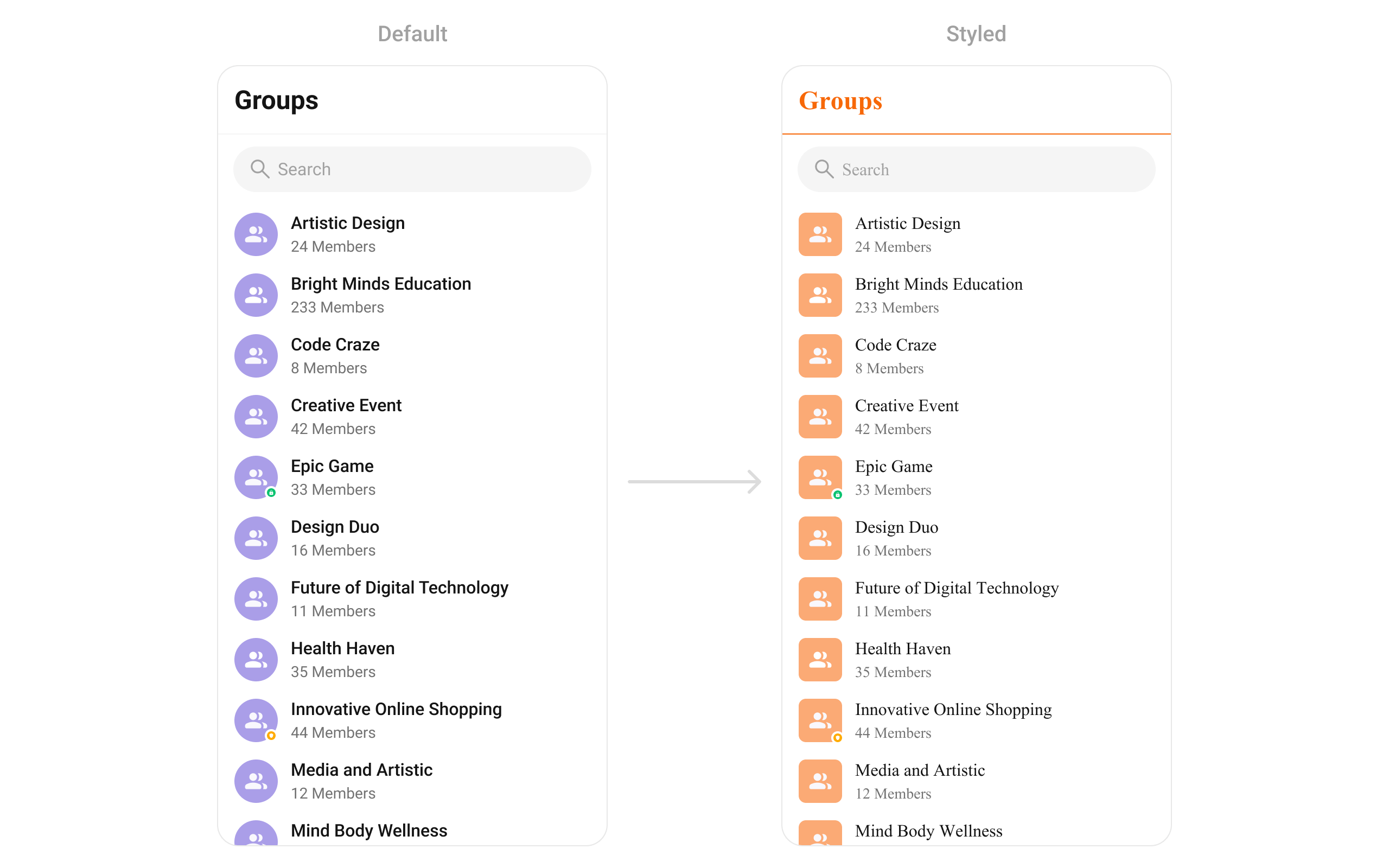
```dart theme={null}
CometChatGroups(
groupsStyle: CometChatGroupsStyle(
avatarStyle: CometChatAvatarStyle(
borderRadius: BorderRadius.circular(8),
backgroundColor: Color(0xFFFBAA75),
),
statusIndicatorStyle: CometChatStatusIndicatorStyle(),
),
)
```
 ### Style Properties
| Property | Description |
| - | - |
| `backgroundColor` | List background color |
| `avatarStyle` | Avatar appearance |
| `statusIndicatorStyle` | Group type indicator |
| `searchBoxStyle` | Search box appearance |
See [Component Styling](/ui-kit/flutter/component-styling) for the full reference.
***
## Next Steps
View and manage group members
Browse recent conversations
Detailed styling reference
Complete group chat implementation
This documentation is built and hosted on [Mintlify](https://mintlify.com), a developer documentation platform.
### Style Properties
| Property | Description |
| - | - |
| `backgroundColor` | List background color |
| `avatarStyle` | Avatar appearance |
| `statusIndicatorStyle` | Group type indicator |
| `searchBoxStyle` | Search box appearance |
See [Component Styling](/ui-kit/flutter/component-styling) for the full reference.
***
## Next Steps
View and manage group members
Browse recent conversations
Detailed styling reference
Complete group chat implementation
This documentation is built and hosted on [Mintlify](https://mintlify.com), a developer documentation platform.