> ## Documentation Index
> Fetch the complete documentation index at: https://cometchat-22654f5b-docs-llms-scoped-indexes.mintlify.site/llms.txt
> Use this file to discover all available pages before exploring further.
# Notification Feed
> Full-screen notification feed component with category filtering, card rendering, real-time updates, and engagement reporting.
| Field | Value |
| - | - |
| Component | `CometChatNotificationFeed` |
| Package | `@cometchat/chat-uikit-react` |
| Import | `import { CometChatNotificationFeed } from "@cometchat/chat-uikit-react";` |
| CSS root class | `.cometchat-notification-feed` |
| Primary output | `onItemClick: (feedItem: NotificationFeedItem) => void` — emits the clicked feed item |
| Prerequisites | App wrapped in [`CometChatProvider`](/ui-kit/react/cometchat-provider) with valid credentials + a logged-in user; plus [Campaigns](/ui-kit/react/campaigns) configured in the Dashboard |
| Stitching | Wire `onItemClick` / `onActionClick` to route the tapped notification (see [Campaigns](/ui-kit/react/campaigns)) |
| SDK listeners (automatic) | Real-time feed updates, delivery/read reporting, and unread-count polling — handled internally |
| Full props | See [Props](#props) |
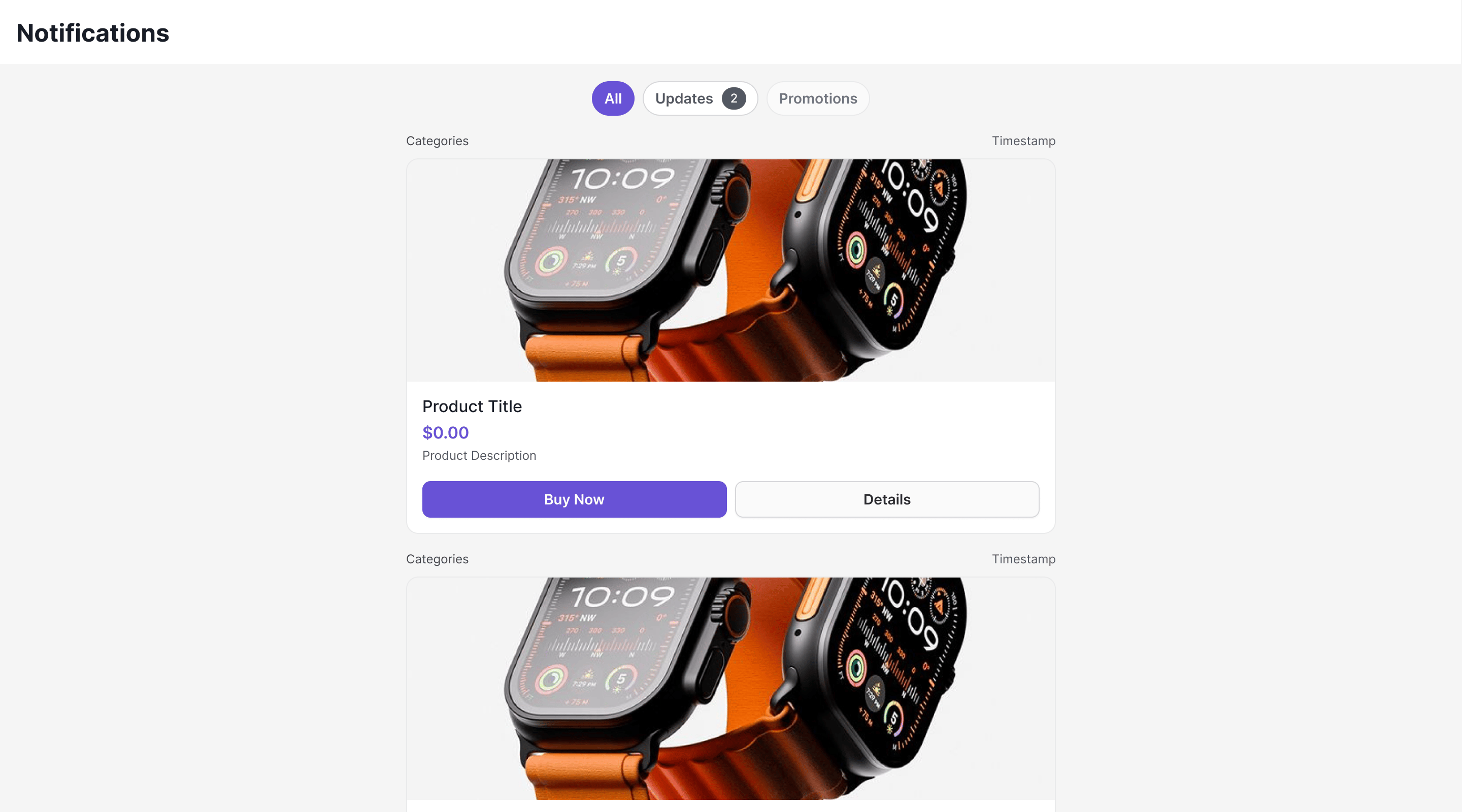
`CometChatNotificationFeed` displays a scrollable notification feed where each item is rendered as a card using `@cometchat/cards-react`. It handles fetching, pagination, category filtering, timestamp grouping, real-time updates, and read/delivered/engagement reporting automatically.
**Prerequisite: Campaigns must be configured first.** The feed only shows content once **Campaigns / Notifications are set up in the CometChat Dashboard** — channels, categories, and card templates. Without this, the feed renders but stays empty. See [Campaigns](/ui-kit/react/campaigns) for the end-to-end setup (Dashboard configuration through frontend wiring).
**Live Preview** — interact with the notification feed component.
[Open in Storybook ↗](https://storybook.cometchat.io/react/?path=/story/components-notification-feed-cometchat-notification-feed--default)
***
## Where It Fits
`CometChatNotificationFeed` is a full-screen component. Drop it into a page or route. It manages its own data fetching, state, and real-time listeners — you just handle navigation callbacks.
```tsx theme={null}
import { CometChatNotificationFeed } from "@cometchat/chat-uikit-react";
function NotificationsPage() {
return (
window.history.back()}
onItemClick={(item) => {
// Handle item click (e.g., open detail or deep link)
}}
/>
);
}
```
***
## Minimal Render
```tsx theme={null}
import { CometChatNotificationFeed } from "@cometchat/chat-uikit-react";
function NotificationsDemo() {
return (
);
}
export default NotificationsDemo;
```
Prerequisites: CometChat SDK initialized with `CometChatUIKit.init()` and a user logged in.
Root CSS class: `.cometchat-notification-feed`
***
## Filtering Feed Items
Control what loads using custom request builders:
```tsx theme={null}
import { CometChatNotificationFeed } from "@cometchat/chat-uikit-react";
import { CometChat } from "@cometchat/chat-sdk-javascript";
function UnreadNotifications() {
return (
);
}
```
### Filter Options
| Builder Method | Description |
| - | - |
| `.setLimit(number)` | Items per page (default 20, max 100) |
| `.setReadState(state)` | `"read"`, `"unread"`, or `"all"` |
| `.setCategory(string)` | Filter by category label |
| `.setChannelId(string)` | Filter by channel |
| `.setTags(string[])` | Filter by tags |
| `.setDateFrom(string)` | ISO 8601 date lower bound |
| `.setDateTo(string)` | ISO 8601 date upper bound |
***
## Actions and Events
### Callback Props
#### onItemClick
Fires when a feed item card is clicked.
```tsx theme={null}
{
console.log("Item clicked:", item.getId());
}}
/>
```
#### onActionClick
Fires when an interactive element (button, link) inside a card is clicked. The `action` object contains the action type, parameters, and the element ID that triggered it.
```tsx theme={null}
{
const { type, params, elementId } = action;
switch (type) {
case "openUrl":
window.open(params.url as string, "_blank");
break;
case "chatWithUser":
// Navigate to chat with params.uid
break;
case "chatWithGroup":
// Navigate to group chat with params.guid
break;
}
}}
/>
```
**Navigation is your app's responsibility.** `onItemClick` and `onActionClick` only report the intent (deep link, `chatWithUser`, `chatWithGroup`, `openUrl`) — the component does not route anywhere on its own. Your app must handle the transition (open the URL, switch to the chat with `params.uid` / `params.guid`, etc.). For the recommended navigation-event pattern, see [Event System — Navigation](/ui-kit/react/event-system#navigation).
#### onError
Fires when an internal error occurs (network failure, SDK exception).
```tsx theme={null}
{
console.error("Feed error:", error.message);
}}
/>
```
#### onBackPress
Fires when the back button in the header is clicked.
```tsx theme={null}
window.history.back()}
/>
```
### Automatic Behaviors
The component handles these automatically — no manual setup needed:
| Behavior | Description |
| - | - |
| Real-time updates | New items appear at the top via WebSocket `NotificationFeedListener` |
| Delivery reporting | Items are reported as delivered when fetched |
| Read reporting | Items are reported as read when visible in viewport (IntersectionObserver) |
| Unread count polling | Polls unread count every 30 seconds to update badges |
| Infinite scroll | Fetches next page when scrolling near the bottom |
| Timestamp grouping | Groups items as "Today", "Yesterday", day name, or date |
| Category filtering | Filter chips row with per-category unread badges |
| Mark all read | Header button to mark all notifications as read |
***
## Customization
### View Props
```tsx theme={null}
}
emptyView={}
loadingView={}
errorView={}
itemView={(item) => }
/>
```
| Slot | Signature | Replaces |
| - | - | - |
| `headerView` | `ReactNode` | Entire header bar |
| `loadingView` | `ReactNode` | Loading state |
| `emptyView` | `ReactNode` | Empty state |
| `errorView` | `ReactNode` | Error state |
| `itemView` | `(item: NotificationFeedItem) => ReactNode` | Individual feed item rendering |
### Compound Composition
For full layout control, use sub-components. Omit any sub-component to hide it:
```tsx theme={null}
```
Available sub-components:
| Sub-component | Description | Props | Flat API equivalent |
| - | - | - | - |
| `Root` | Context provider and container | All Root props + `children` | — |
| `Header` | Header bar with title + mark-all-read | `title`, `showBackButton`, `onBackPress`, `children` | `headerView` |
| `FilterChips` | Category filter chips | `children` | — |
| `List` | Scrollable feed list | `itemView` | `itemView` |
| `Item` | Individual feed item | `item`, `cardThemeMode`, `cardThemeOverride` | — |
| `EmptyState` | Empty state | `children` | `emptyView` |
| `ErrorState` | Error state | `children` | `errorView` |
| `LoadingState` | Loading state | `children` | `loadingView` |
### CSS Styling
Override design tokens on the component selector:
```css theme={null}
.cometchat-notification-feed {
--cometchat-background-color-01: #1a1a2e;
--cometchat-text-color-primary: #ffffff;
}
```
### CSS Classes
| Class | Description |
| - | - |
| `.cometchat-notification-feed` | Root container |
| `.cometchat-notification-feed__header` | Header bar |
| `.cometchat-notification-feed__header-title` | Header title text |
| `.cometchat-notification-feed__header-back` | Back button |
| `.cometchat-notification-feed__mark-all-read` | Mark all read button |
| `.cometchat-notification-feed__chips` | Filter chips container |
| `.cometchat-notification-feed__chip` | Individual filter chip |
| `.cometchat-notification-feed__chip--active` | Active filter chip |
| `.cometchat-notification-feed__chip--inactive` | Inactive filter chip |
| `.cometchat-notification-feed__chip-badge` | Chip unread badge |
| `.cometchat-notification-feed__content` | Scrollable content area |
| `.cometchat-notification-feed__item` | Feed item container |
| `.cometchat-notification-feed__item--unread` | Unread feed item |
| `.cometchat-notification-feed__unread-indicator` | Unread dot indicator |
| `.cometchat-notification-feed__item-meta` | Item metadata row (category + time) |
| `.cometchat-notification-feed__card-container` | Card wrapper |
| `.cometchat-notification-feed__loading` | Loading state |
| `.cometchat-notification-feed__empty` | Empty state |
| `.cometchat-notification-feed__error` | Error state |
***
## Props
All props are optional.
***
### title
Header title text.
| | |
| - | - |
| Type | `string` |
| Default | `"Notifications"` |
***
### showHeader
Shows/hides the entire header.
| | |
| - | - |
| Type | `boolean` |
| Default | `true` |
***
### showBackButton
Shows/hides the back button in the header.
| | |
| - | - |
| Type | `boolean` |
| Default | `false` |
***
### showFilterChips
Shows/hides the category filter chips row.
| | |
| - | - |
| Type | `boolean` |
| Default | `true` |
***
### notificationFeedRequestBuilder
Custom request builder for fetching feed items.
| | |
| - | - |
| Type | `CometChat.NotificationFeedRequestBuilder` |
| Default | SDK default (20 per page) |
***
### notificationCategoriesRequestBuilder
Custom request builder for fetching categories.
| | |
| - | - |
| Type | `CometChat.NotificationCategoriesRequestBuilder` |
| Default | SDK default (50 per page) |
***
### onItemClick
Callback fired when a feed item card is clicked.
| | |
| - | - |
| Type | `(feedItem: NotificationFeedItem) => void` |
| Default | `undefined` |
***
### onActionClick
Callback fired when an interactive element inside a card is clicked.
| | |
| - | - |
| Type | `(feedItem: NotificationFeedItem, action: CardAction) => void` |
| Default | `undefined` |
The `CardAction` object contains:
* `type` — Action type (e.g., `"openUrl"`, `"chatWithUser"`)
* `params` — Action parameters (e.g., `{ url: "..." }`, `{ uid: "..." }`)
* `elementId` — ID of the element that triggered the action
***
### onError
Callback fired when the component encounters an error.
| | |
| - | - |
| Type | `(error: CometChat.CometChatException) => void` |
| Default | `undefined` |
***
### onBackPress
Callback fired when the back button is pressed.
| | |
| - | - |
| Type | `() => void` |
| Default | `undefined` |
***
### cardThemeMode
Theme mode for the card renderer (`@cometchat/cards-react`).
| | |
| - | - |
| Type | `"auto" \| "light" \| "dark"` |
| Default | `"auto"` |
***
### cardThemeOverride
Custom theme override passed to the card renderer.
| | |
| - | - |
| Type | `Record` |
| Default | `undefined` |
***
### headerView
Custom component replacing the entire header.
| | |
| - | - |
| Type | `ReactNode` |
| Default | Built-in header with title and mark-all-read button |
***
### loadingView
Custom component displayed during the initial loading state.
| | |
| - | - |
| Type | `ReactNode` |
| Default | Built-in loading state |
***
### errorView
Custom component displayed when an error occurs.
| | |
| - | - |
| Type | `ReactNode` |
| Default | Built-in error state with retry button |
***
### emptyView
Custom component displayed when there are no notifications.
| | |
| - | - |
| Type | `ReactNode` |
| Default | Built-in empty state with illustration |
***
### itemView
Custom renderer for each feed item.
| | |
| - | - |
| Type | `(item: NotificationFeedItem) => ReactNode` |
| Default | Built-in card renderer |
***
## Additional Exports
### useNotificationUnreadCount
A React hook for tracking unread notification count. Uses a shared singleton — multiple components share one polling interval and WebSocket listener.
```tsx theme={null}
import { useNotificationUnreadCount } from "@cometchat/chat-uikit-react";
function NotificationIcon() {
const { count, refresh, isLoading } = useNotificationUnreadCount();
return (
);
}
```
#### Options
| Option | Type | Default | Description |
| - | - | - | - |
| `category` | string | undefined | Filter count by category |
| `pollingInterval` | number | 30000 | Polling interval in milliseconds |
#### Return Value
| Field | Type | Description |
| - | - | - |
| `count` | number | Current unread count |
| `refresh` | `() => Promise` | Manually refresh the count |
| `isLoading` | boolean | Whether the initial fetch is in progress |
***
## Common Patterns
### Show only unread items
```tsx theme={null}
```
### Hide filter chips and header
```tsx theme={null}
```
### Embed in a sidebar
```tsx theme={null}
import { CometChatNotificationFeed } from "@cometchat/chat-uikit-react";
function NotificationsSidebar() {
return (
);
}
```
### Add notification badge to navigation
```tsx theme={null}
import { useState } from "react";
import {
CometChatNotificationFeed,
useNotificationUnreadCount,
} from "@cometchat/chat-uikit-react";
function App() {
const [showFeed, setShowFeed] = useState(false);
const { count } = useNotificationUnreadCount();
return (
<>
{showFeed && (
setShowFeed(false)}
showBackButton={true}
/>
)}
);
}
```
***
## Next Steps
Overview of how campaigns work end-to-end
Low-level SDK APIs for feed items, categories, and engagement
Customize colors, fonts, and appearance
Browse all prebuilt UI components
This documentation is built and hosted on [Mintlify](https://mintlify.com), a developer documentation platform.