> ## Documentation Index
> Fetch the complete documentation index at: https://cometchat-22654f5b-docs-llms-scoped-indexes.mintlify.site/llms.txt
> Use this file to discover all available pages before exploring further.
# Color Resources
> Complete reference of all CSS variables in the CometChat React UI Kit for light and dark modes, custom themes, and brand styling.
| Field | Value |
| - | - |
| Goal | Override UI Kit color tokens to match a brand |
| Where | `App.css` (global) — import in app entry via `import "./App.css";` |
| Scope | Override variables on `.cometchat` (global) or `.cometchat-` (component-specific) |
| Key tokens | `--cometchat-primary-color` (brand/accent), `--cometchat-neutral-color-300` (incoming bubbles, default `#E8E8E8`), `--cometchat-background-color-01` (main background) |
| Dark mode | Source uses `[data-theme="dark"]` on `:root`. App-controlled: `.cometchat-root[data-theme="dark"] .cometchat` |
| Source file | [css-variables.css on GitHub](https://github.com/cometchat/cometchat-uikit-react/blob/v6/src/styles/css-variables.css) |
| Constraints | Global CSS only (no CSS Modules), no `!important`, component-level overrides take precedence over global |
The UI Kit's color palette uses CSS variables for consistent styling. Override these tokens on `.cometchat` or `.cometchat-` to match your brand.
Prerequisites:
1. Import the base stylesheet: `@import url("@cometchat/chat-uikit-react/css-variables.css");` in `App.css`
2. Import the CSS file at the app entry: `import "./App.css";` in `App.tsx`
3. All overrides must target `.cometchat` or a `.cometchat-` class
4. Use global CSS (not CSS Modules with hashed class names) — hashed selectors won't match
***
## Selector Contract
Canonical selector patterns for overriding colors.
**Global override**
```css lines theme={null}
.cometchat { --token: value; }
```
**Component override**
```css lines theme={null}
.cometchat .cometchat-conversations { --token: value; }
```
**Dark mode override (app-controlled)**
```css lines theme={null}
.cometchat-root[data-theme="dark"] .cometchat { --token: value; }
```
The source stylesheet defines dark mode defaults on `[data-theme="dark"]` at the `:root` level. When controlling dark mode from the app, place `data-theme` on the wrapper and scope overrides accordingly.
***
## CSS Variable Reference
This table maps every commonly used token to what it visually controls.
| Variable | What It Controls | Default (Light) | Used By |
| - | - | - | - |
| `--cometchat-primary-color` | Brand accent, outgoing bubble bg, active states, links, buttons | `#6852D6` | Outgoing bubbles, send button, active tabs, links |
| `--cometchat-neutral-color-300` | Incoming bubble background, borders | `#E8E8E8` | Incoming message bubbles, border-color-default |
| `--cometchat-neutral-color-400` | Secondary backgrounds, dividers | `#DCDCDC` | Borders, secondary panels |
| `--cometchat-neutral-color-500` | Muted text, placeholders | `#A1A1A1` | Placeholder text, disabled states |
| `--cometchat-neutral-color-600` | Secondary text | `#727272` | Timestamps, subtitles |
| `--cometchat-neutral-color-700` | Primary text | `#5B5B5B` | Main body text |
| `--cometchat-neutral-color-800` | Headings, strong text | `#434343` | Component titles, names |
| `--cometchat-neutral-color-900` | Strongest text | `#141414` | Text color primary |
| `--cometchat-neutral-color-50` | White surface | `#FFFFFF` | Background color 01, text-color-white |
| `--cometchat-background-color-01` | Main app background | `var(--cometchat-neutral-color-50)` | Root container background |
| `--cometchat-background-color-02` | Secondary/panel background | `var(--cometchat-neutral-color-100)` | Sidebars, panels |
| `--cometchat-background-color-03` | Tertiary background | `var(--cometchat-neutral-color-200)` | Nested panels, cards |
| `--cometchat-background-color-04` | Quaternary background | `var(--cometchat-neutral-color-300)` | Additional surface layer |
| `--cometchat-extended-primary-color-50` through `900` | Primary color scale (lightest to darkest) | See palette below | Hover states, gradients, shades |
| `--cometchat-font-family` | All text in UI Kit | `'Roboto', 'Inter'` | Global typography |
| `--cometchat-text-color-highlight` | Highlighted/linked text | `var(--cometchat-primary-color)` | Links, mentions, highlights |
| `--cometchat-icon-color-highlight` | Highlighted icon color | `var(--cometchat-primary-color)` | Active icons, selected states |
| `--cometchat-text-color-secondary` | Secondary/caption text | `var(--cometchat-neutral-color-600)` | Timestamps, subtitles, captions |
| `--cometchat-icon-color-secondary` | Secondary icon color | `var(--cometchat-neutral-color-500)` | Inactive icons |
| `--cometchat-border-color-default` | Default border color | `var(--cometchat-neutral-color-300)` | Dividers, input borders |
| `--cometchat-info-color` | Informational states | `#0B7BEA` | Info callouts |
| `--cometchat-warning-color` | Warning states | `#FFAB00` | Warning callouts |
| `--cometchat-success-color` | Success states | `#09C26F` | Online indicators, success messages |
| `--cometchat-error-color` | Error states | `#F44649` | Error messages, validation |
| `--cometchat-message-seen-color` | Seen/read indicator color | (dark mode only: `#56E8A7`) | Read receipts |
| `--cometchat-primary-button-background` | Primary button fill | `var(--cometchat-primary-color)` | Send button, action buttons |
| `--cometchat-primary-button-text` | Primary button text | `#FFFFFF` (static white) | Button labels |
| `--cometchat-primary-button-icon` | Primary button icon | `#FFFFFF` (static white) | Button icons |
| `--cometchat-secondary-button-background` | Secondary button fill | `var(--cometchat-neutral-color-900)` | Secondary action buttons |
| `--cometchat-secondary-button-text` | Secondary button text | `var(--cometchat-neutral-color-900)` | Secondary button labels |
| `--cometchat-secondary-button-icon` | Secondary button icon | `var(--cometchat-neutral-color-900)` | Secondary button icons |
| `--cometchat-link-button` | Link button color | `var(--cometchat-info-color)` | Inline link buttons |
| `--cometchat-fab-button-background` | FAB button fill | `var(--cometchat-primary-color)` | Floating action button |
| `--cometchat-fab-button-icon` | FAB button icon | `#FFFFFF` (static white) | FAB icon |
| `--cometchat-white-hover` | Hover state on white surfaces | `var(--cometchat-neutral-color-100)` | List item hover |
| `--cometchat-white-pressed` | Pressed state on white surfaces | `var(--cometchat-neutral-color-300)` | List item press |
***
**CSS Specificity & Precedence Rules:**
1. Component-level overrides (`.cometchat .cometchat-conversations { --var: val }`) take precedence over global overrides (`.cometchat { --var: val }`)
2. Dark mode overrides (`[data-theme="dark"]`) take precedence over light mode defaults
3. CSS variable overrides only affect properties the UI Kit theme binds to that variable — they do NOT change layout or spacing
4. Always keep the `.cometchat` prefix to avoid leaking styles into the host app
5. `!important` should never be needed — if it is, the selector specificity is wrong
***
## Color Palette
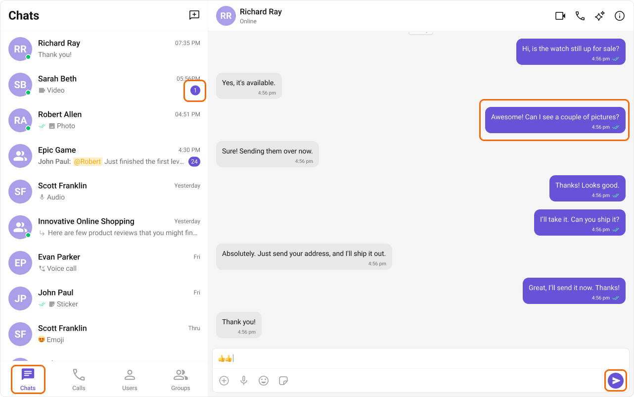
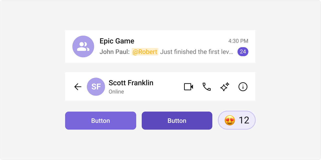
The primary color defines key actions, branding, and UI elements, while the extended primary palette provides variations for supporting components.
### Primary Color
#### Light Mode
 ```css lines theme={null}
--cometchat-primary-color: #6852D6;
--cometchat-extended-primary-color-50: #F9F8FD;
--cometchat-extended-primary-color-100: #EDEAFA;
--cometchat-extended-primary-color-200: #DCD7F6;
--cometchat-extended-primary-color-300: #CCC4F1;
--cometchat-extended-primary-color-400: #BBB1ED;
--cometchat-extended-primary-color-500: #AA9EE8;
--cometchat-extended-primary-color-600: #9A8BE4;
--cometchat-extended-primary-color-700: #8978DF;
--cometchat-extended-primary-color-800: #7965DB;
--cometchat-extended-primary-color-900: #5D49BE;
```
***
#### Dark Mode
```css lines theme={null}
--cometchat-primary-color: #6852D6;
--cometchat-extended-primary-color-50: #F9F8FD;
--cometchat-extended-primary-color-100: #EDEAFA;
--cometchat-extended-primary-color-200: #DCD7F6;
--cometchat-extended-primary-color-300: #CCC4F1;
--cometchat-extended-primary-color-400: #BBB1ED;
--cometchat-extended-primary-color-500: #AA9EE8;
--cometchat-extended-primary-color-600: #9A8BE4;
--cometchat-extended-primary-color-700: #8978DF;
--cometchat-extended-primary-color-800: #7965DB;
--cometchat-extended-primary-color-900: #5D49BE;
```
***
#### Dark Mode
 ```css lines theme={null}
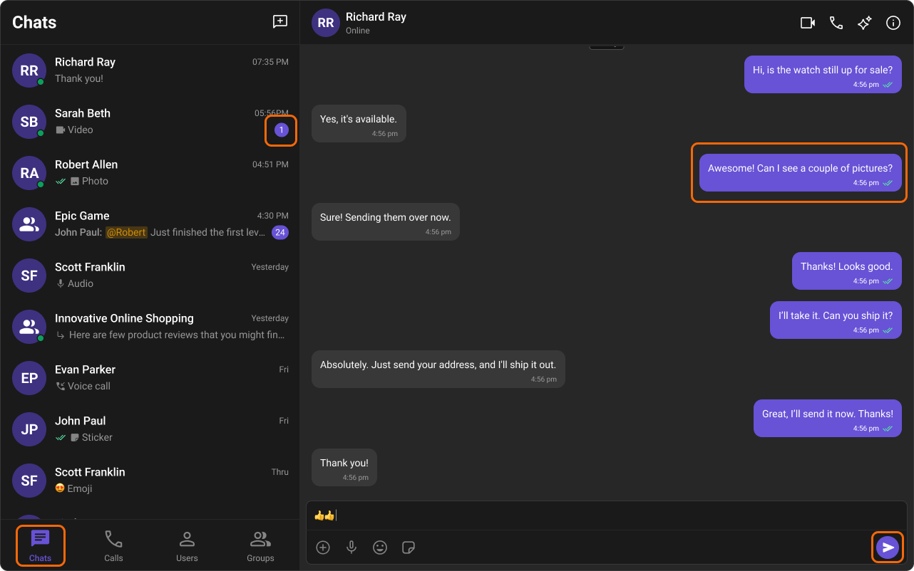
--cometchat-primary-color: #6852D6;
--cometchat-extended-primary-color-50: #15102B;
--cometchat-extended-primary-color-100: #1D173C;
--cometchat-extended-primary-color-200: #251E4D;
--cometchat-extended-primary-color-300: #2E245E;
--cometchat-extended-primary-color-400: #362B6F;
--cometchat-extended-primary-color-500: #3E3180;
--cometchat-extended-primary-color-600: #473892;
--cometchat-extended-primary-color-700: #4F3EA3;
--cometchat-extended-primary-color-800: #5745B4;
--cometchat-extended-primary-color-900: #7460D9;
```
### Extended Primary Colors
#### Light Mode
```css lines theme={null}
--cometchat-primary-color: #6852D6;
--cometchat-extended-primary-color-50: #15102B;
--cometchat-extended-primary-color-100: #1D173C;
--cometchat-extended-primary-color-200: #251E4D;
--cometchat-extended-primary-color-300: #2E245E;
--cometchat-extended-primary-color-400: #362B6F;
--cometchat-extended-primary-color-500: #3E3180;
--cometchat-extended-primary-color-600: #473892;
--cometchat-extended-primary-color-700: #4F3EA3;
--cometchat-extended-primary-color-800: #5745B4;
--cometchat-extended-primary-color-900: #7460D9;
```
### Extended Primary Colors
#### Light Mode
 #### Dark Mode
 ***
## Complete End-to-End Example: Custom Brand Colors
**Step 1:** Add to `App.css`:
```css lines theme={null}
@import url("@cometchat/chat-uikit-react/css-variables.css");
/* Light mode brand override */
.cometchat {
--cometchat-primary-color: #f76808;
--cometchat-extended-primary-color-500: #fbaa75;
--cometchat-extended-primary-color-900: #c45206;
--cometchat-text-color-highlight: #f76808;
--cometchat-icon-color-highlight: #f76808;
}
/* Dark mode brand override */
.cometchat-root[data-theme="dark"] .cometchat {
--cometchat-primary-color: #f76808;
--cometchat-extended-primary-color-500: #7a3404;
--cometchat-extended-primary-color-900: #fbaa75;
}
```
**Step 2:** Ensure `App.tsx` imports the CSS:
```tsx lines theme={null}
import "./App.css";
// ... render CometChat UI Kit components
```
**Expected result:** All primary-colored elements (outgoing bubbles, buttons, active states, links) change from purple (#6852D6) to orange (#f76808) in both light and dark modes.
This documentation is built and hosted on [Mintlify](https://mintlify.com), a developer documentation platform.
***
## Complete End-to-End Example: Custom Brand Colors
**Step 1:** Add to `App.css`:
```css lines theme={null}
@import url("@cometchat/chat-uikit-react/css-variables.css");
/* Light mode brand override */
.cometchat {
--cometchat-primary-color: #f76808;
--cometchat-extended-primary-color-500: #fbaa75;
--cometchat-extended-primary-color-900: #c45206;
--cometchat-text-color-highlight: #f76808;
--cometchat-icon-color-highlight: #f76808;
}
/* Dark mode brand override */
.cometchat-root[data-theme="dark"] .cometchat {
--cometchat-primary-color: #f76808;
--cometchat-extended-primary-color-500: #7a3404;
--cometchat-extended-primary-color-900: #fbaa75;
}
```
**Step 2:** Ensure `App.tsx` imports the CSS:
```tsx lines theme={null}
import "./App.css";
// ... render CometChat UI Kit components
```
**Expected result:** All primary-colored elements (outgoing bubbles, buttons, active states, links) change from purple (#6852D6) to orange (#f76808) in both light and dark modes.
This documentation is built and hosted on [Mintlify](https://mintlify.com), a developer documentation platform.